Products
Case studies
Industries
Resources
I’m an Influencer
Table of Contents
Facebook Ads have the power to transform your eCommerce business into a powerhouse, generating hundreds of thousands of dollars each month, if done correctly. That’s why we have compiled 14 Facebook ad examples that demonstrate how to do it right.
By accessing Facebook’s user base of more than 1.66 billion daily active users you can use this new eCommerce marketing trend to hyper-focus your brand’s marketing to exactly the right customer.
And it’s not just Facebook, their little sister, Instagram, has the power too. For example, International sunglasses brand, Meller, saw a 13.9% lower cost per click with Instagram ads featuring visual customer content. The power of social ads is huge!
Back to just Facebook, their total ad revenue in 2018 reached 55.01 billion dollars worldwide and is expected to reach 80.93 billion dollars in 2020. If you want to grow your business today, it is absolutely imperative that you use Facebook ads. But the big question for marketers is:
How do you design the perfect Facebook ad that converts?
A lot of people will start throwing money at Facebook, but not see any success. This comes either because they don’t have a proper strategy for their Facebook ads or their ads are not well designed. But for those brands which have a good strategy and work hard to test and refine their advertising, Facebook ads can generate huge profits. And we’ve found 14 of such examples.
Authenticity in Facebook ads is crucial because it fosters trust and credibility among consumers. In an era where audiences are bombarded with advertisements, genuine and relatable content stands out, making users more likely to engage with and remember the brand. Authentic ads resonate better with consumers’ real-life experiences, driving higher engagement rates and fostering brand loyalty. Additionally, authentic content can help mitigate skepticism and ad fatigue, leading to more effective and meaningful connections with the target audience.
We’ve scoured the web and have highlighted below 14 brands which are doing really well with their Facebook advertising.
Even if you’ve already been using Facebook ads for some time, make sure to check out our list for some inspiration on your next ad buy.

If you listen to any podcasts at all (shout out Bill Simmons) you’ll have definitely heard ads for innovative underwear brand MeUndies. Their revolutionary underwear is super soft and stays fresh based on new technology.
Key Takeaways: Their creative use of multi-image ads is funny and appealing. They didn’t just post several different clothing items, but used the multi-image display itself to stylize their ad.
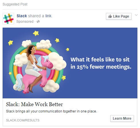
This is a really great ad because the visuals are pop out. How often do you see a woman riding a unicorn pop up in your feed? Additionally, the contrasting colors draw a lot of attention to the subject. It’s a great picture.
Key Takeaways: The copy completes the ad by connecting this otherworldly feeling with the benefits Slack provides. It creates a complete image of the goal of working less and daydreaming more. It’s a great ad because it creates a feeling, rather than simply presenting an offer.
It’s a lighthearted ad for a serious app for getting work done.
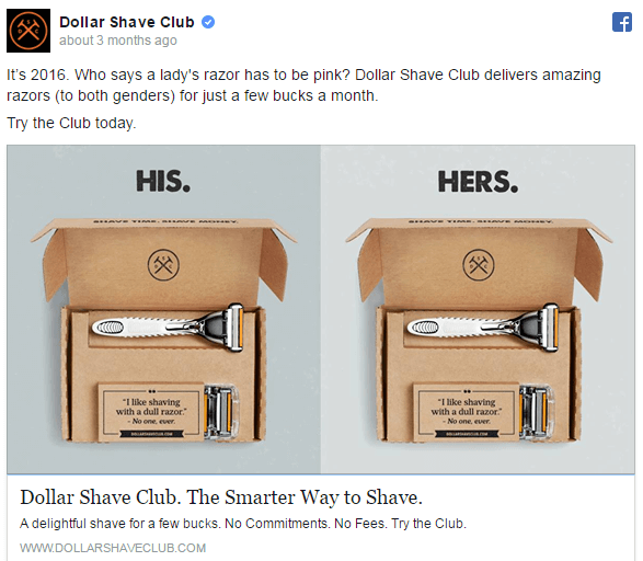
Sometimes simple is best. Dollar Shave Club makes our list for its effective copy. By making a joke at other brands which try to make a gender specific product, they simply show that their product is great, no matter who uses it.
Key Takeaways: The ad presents exactly what you’ll receive when you purchase the product. It’s also honest with it’s customers about who should use their product. They don’t try to pigeonhole anyone and simply focus on what makes their product the best.
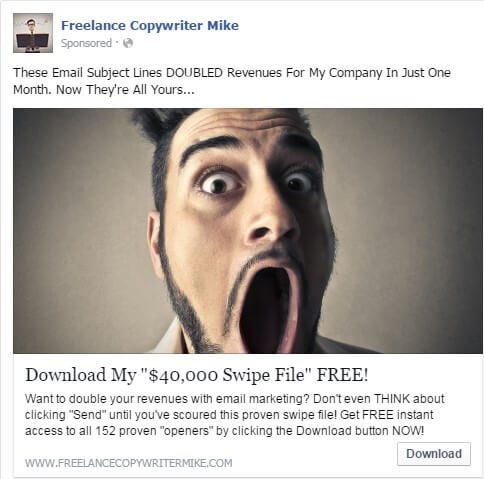
You can automatically tell why this ad is engaging… the image is crazy and instantly draws your attention to it. And below you’re presented with an amazing offer – all for “FREE!”
Key Takeaways: Delving deeper, the image actually matched the offer. Mike offers to teach his clients how to write better email subject lines that get opened. His offer is to teach you how to make a splash, just like his Facebook ad does.
Make sure your copy and your image match if possible and if it can be a little off kilter, it can take your ad to the next level.
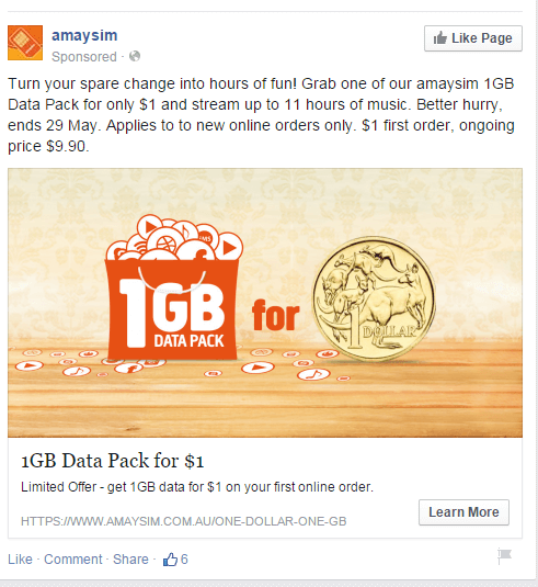
Amaysim does everything right here by presenting their offer in clear visual terms. You don’t even have to read the rest of the ad copy because you can already understand their offer just from the image alone.
Key Takeaways: In your own ads, try to be as visual as possible with your offer. The easier you make it for your ad viewer to understand exactly what you’re advertising, the higher your conversion rate will be.
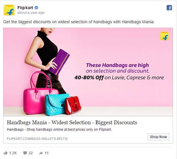
Flipkart is an online eCommerce site that focuses on fashion accessories.
Key Takeaways: Bright and bold, Flipkart’s ad colors draw attention to the merchandise itself. The copy isn’t great, but it converts.
Their word selection is everything, even if it doesn’t have the best grammar. Images are what really matters when it comes to Facebook ads, but giving a discount doesn’t hurt.
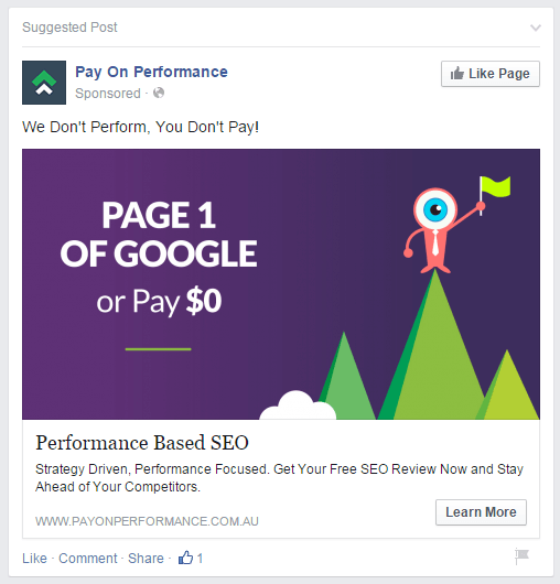
Google is the king of advertising and they know exactly what their users want from their service. Namely to be #1 in search rankings. Pay on Performance capitalizes on this by promising to deliver results or you don’t pay at all.
Key Takeaways: In your own ads you can try a similar offer by guaranteeing results. It’s a bold move though because if you can’t deliver as promised, you’ll lose clients. Additionally, the bold, contrasting colors draw your attention to it as you scroll through your news feed.
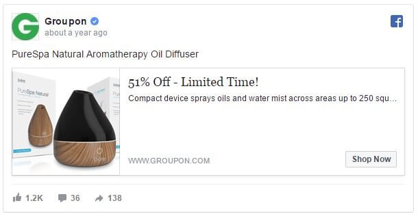
Everyone knows Groupon for their massive deals and that’s exactly what they provide to their customers – deep deals.
Key Takeaways: The main topic of the ad is the offer, 51% off and only for a limited time. This plays on scarcity and gets more people to click due to fear of missing out.
Adding a button can increase your click through rate. If you aren’t using them already, try putting one in your next ad.
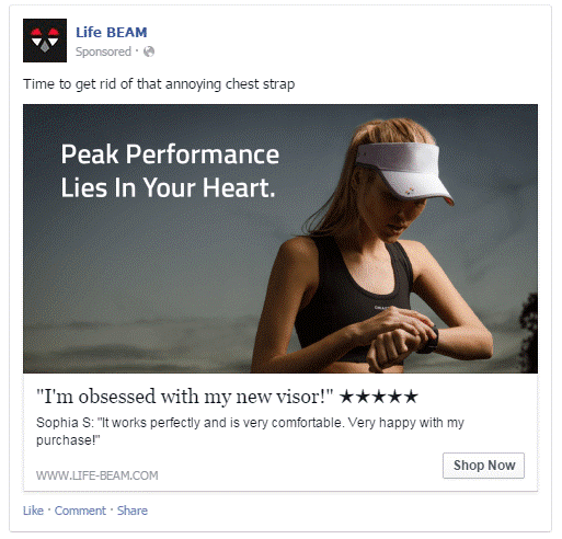
One of the bigger trends right now with Facebook ads is the use of User Generated Content marketing. It’s a great way to engage your user base, increase customer loyalty and get great word of mouth marketing.
Life BEAM does a great job by highlighting a short review by one of their customers, taking their actual words and star rating to use to market their ad.
Key Takeaways: You can do the same thing for your own Facebook ads. Find your most devoted, happy customers and plaster them front and center in your marketing. By showing actual people, who had their problem solved thanks to your product, you can hyper-target your ads, because you know exactly who and what your product will help.
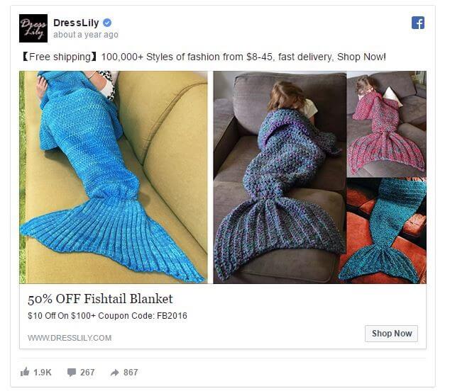
Dress Lily is an online dropshipper that offers men and women’s clothing. They have a huge selection and they show it off in their ad.
Key Takeaways: The blanket itself is something that every little girl would want after watching the Little Mermaid. In the ad they show a little girl, so the target market for this would be parents with young children.
They give prices in the description as well as a 50% discount offer.
They show that shopping with them has tons of value, between the discount code and the free shipping offer. The ad is packed with info that customer would want.
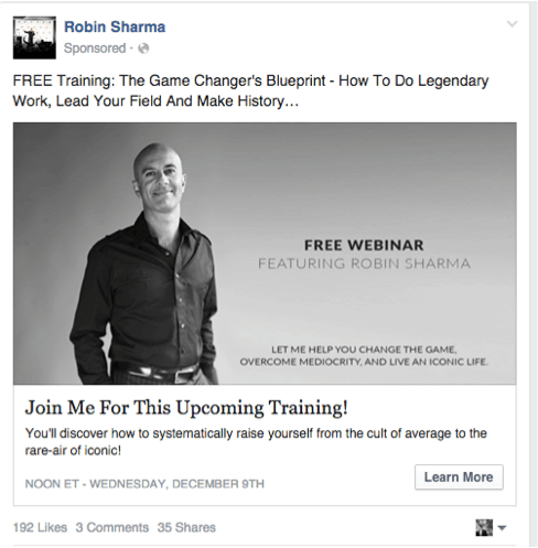
When designing your ads, focus on one thing. In Robin Sharma’s webinar offer, everything is directed towards one goal: getting you interested in his upcoming training program.
The ad starts out by describing exactly what he is offering – “FREE Training” on how to be successful in your life and work. The viewer immediately understands what they’re getting and what they’ll learn from the webinar.
Key Takeaways: What could be added is more information about the benefits of the course and what the expected results of attending the webinar will be. It also could define further who should attend the course, but this could’ve already been determined by whose feed it appears in.
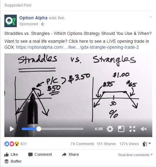
Option Alpha is an options education platform created to help people learn how to trade and make money.
Key Takeaways: The “ad” is an almost 10-minute-long video on one specific aspect of trading that a lot of people might have issues with.
The benefits of using a video ad here are that the viewers get to see how Option Alpha teaches and whether there would be good value in their course. It’s a great pre-sale technique, where they demonstrate great value and then drive people to a landing page where they watch 2-3 videos about the options education course.
Use this next time you have an ad for anything educational. Make a lesson plan and record it to video, then use the lessons to introduce people to how you teach and get them into your courses.
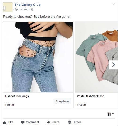
The Variety Club is a dropshipper that only sells women’s clothes.
Key Takeaway: The ad here is amazing because it’s a history of things which I viewed on their website. Using a Facebook Pixel, they were able to collect their customer’s viewing history and then retarget them directly with those items.
It’s a brilliant marketing technique and something you can ONLY do with Facebook ads.
Your pixel should be an integral part of your sales funnel. It allows you to track and retarget ads to people who have come to your site.
You can specifically target those people who add items to cart, only to abandon them later, or you can retarget ads to people who have already bought goods from you, giving them special deals and offers.
In addition to the item tracking, The Variety Club’s ad also has multiple pictures, linking to multiple products in their store. So, even though their customers may not be interested in the first item, they might be interested in buying another one.
Use these types of ads next time for better product visibility and to give your customer more choice.
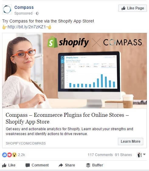
This is a great ad for a few reasons. For one, it targets a specific niche: those who are using Shopify and want better analytics.
Key Takeaways: By showing a screenshot of their analytical software and a happy model using it, they show that their software is easy to integrate, easy to use and should be an essential app used by people who need in-depth analytics for their shop.
What’s great about the ad is that it uses logos to come from a place of authority, leveraging the Shopify logo to seem like a more authoritative product.
Additionally, they have a “learn more” button on the side directing viewers to take direct action to try out their app.
We’ve presented quite a lot here and there are a ton of different strategies and offers. However, the three biggest takeaways for Facebook Ads regardless of what you are selling are the following:
1. Video is King
Visual ads give you the greatest chance to engage with your ad viewers. You can show them exactly how they can benefit from your product. Most importantly, though, video allows you to create a personal connection that a regular print ad can’t.
Plus, video tends to get more engagement than photo or text ads.
2. Provide Valuable Offers
Make sure that your ads fit your sales strategy. If you want to sell a book, try a Free + Shipping offer or try bundles. Additionally, you could try limited time coupon codes to spur people to buy.
The key is to figure out what makes your customer come to your shop and then increase their hunger for your product.
3. Make a Connection
Get personal.
A lot of eCommerce nowadays is based on personality. Your brand needs to come off as genuine and real to be able to connect with customers.
Want to connect better with customers? Book a demo to explore our UGC solution today.
In 2017, people’s bs-meters have never been higher, so cut through the fluff and provide high-quality, actionable content that will provide direct benefit to your customer.
What better way to make a connection than using the images and videos that your customers share about your brand to attract new customers and engage with the repeating? Check out Flowbox’s platform to learn more about this marketing strategy.
How will you change your Facebook Ad strategy?
Facebook will continue to grow and your business needs to take advantage of the power of its advertising platform to be successful. It’s never been easier to access and create Facebook ads, but make sure you have a proper strategy in place before you begin.
Now you’ve learned about what Facebook Ads have to offer, why not take a look at our Instagram Marketing Guide to see how your brand can achieve brilliant engagement across all social media?