Products
Case studies
Industries
Resources
I’m an Influencer
Table of Contents
Customer retention strategies are meant to RETAIN your customers, right?
Unfortunately, that’s not always the case.
There are some common “customer retention strategies” – certain tools and widgets – that are actually losing you customers. Bad news.
You may even be using some of them without even knowing it!
Don’t worry – in this post, I’ll reveal 5 common tools and widgets among the eCommerce world that you should stop using right away.
Let’s dive in.
Disclaimer: What you’re about to learn may or may not improve your conversions and retention rates. While I have found studies backing up my points, every site and niche is different. That’s why it’s important to test these things on your own store before fully implementing them!
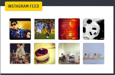
Marketing on Instagram is amazing with huge potential to improve your conversions and increase customer retention. I won’t deny that.
However, including an Instagram widget on your site, like the one in the image below, can actually take people off your page and stop them from becoming a customer.
The reason is obvious: Clicking an image takes them to Instagram, and away from your store.

Instead of an Instagram widget, consider implementing a shoppable Instagram feed to your store, like this:
This way, you still display photos of your products and User Generated Content, but you won’t lose sales because it keeps the user on your site and gives them a buy button right from the post. An advanced UGC platform such as Flowbox is a good option to integrate those images into your eCommerce site.
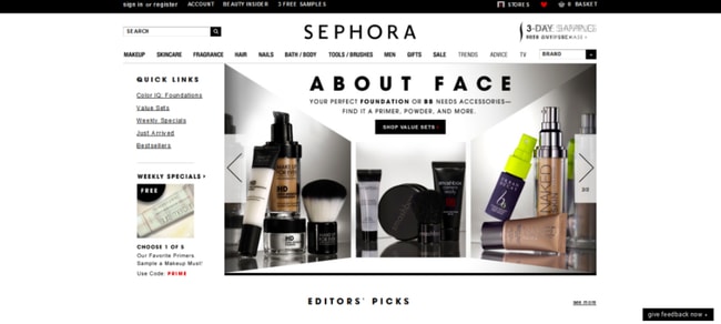
Automatic image sliders and carousels have become a massive trend lately for online stores. They look great…
…but they don’t function very well.
According to ConversionXL, there are 4 reasons not to use them:
If that’s not enough, one study even found that only 4% of people click on a carousel image, and of those clicks, 90% go to the first image on the slide. Yikes.
After all, in the words of Steve Jobs:
Design is not just what it looks and feels like. Design is how it works.
Just use static images and text. Keep things simple, clean, and usable.
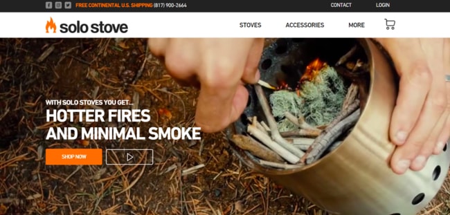
One of my personal favorite eCommerce home pages is Solo Stove:
Now, you’ll notice they use a video – probably not a whole lot better than a carousel. However, due to the nature of their customer base – people looking for a great fire – a video might be a fine choice of customer retention strategies. It lets them capture what their product does and gives you the feeling you’d have if you bought the product.
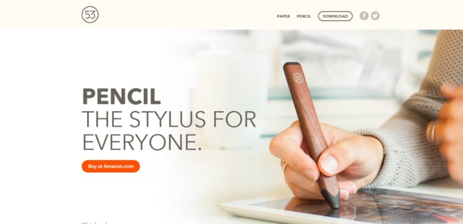
But still, if you want an example with pure static images and text, Pencil 53 is a beautiful (and functional) eCommerce site:
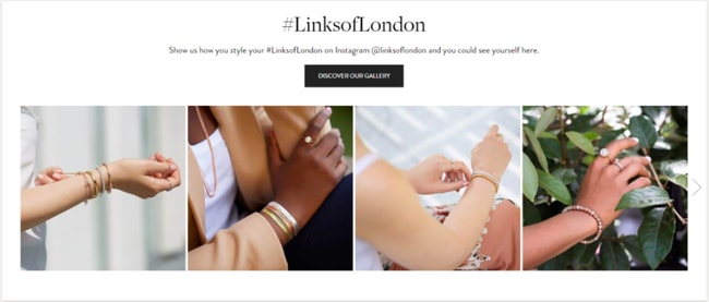
Finally, some of our customers have added User Generated Content to static slides and saw a conversion increase, like Links of London:
To help you redesign your homepage, consider following these tips.
Popups are highly controversial. On one hand, they work. On the other, they drive people crazy.
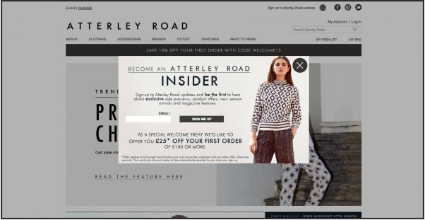
Personally, I love pop-ups. However, they should not be used as soon as someone reaches your site. Especially if they’re disruptive and take over the screen, like this:
(This particular one also breaks tons of other popup best practices, like having way too much information, but that’s beside the point.)
The stats back it up – people don’t like popups:
Is that to say you shouldn’t use popups at all? Not exactly.
68% of searchers would want to block a site from search results because it has too many ads
Instead of showing a pop-up immediately upon entry, only show them after 20-30 seconds or, better yet, only on exit-intent.
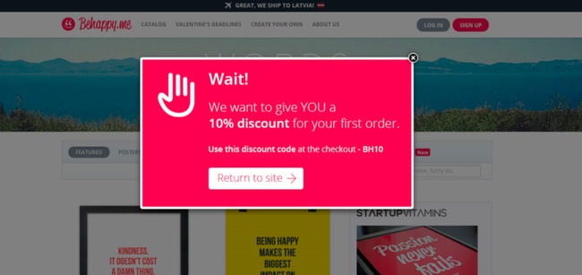
Additionally, make your pop-up simple, clean, and benefit-driven. Offer a discount or something of value to the user, not a generic “sign up for email updates” message. (Come on, who in their right mind wants more email updates these days?)
Here’s a great example:
Notice this one doesn’t even ask for an email. While I’m not saying this is a great idea, it’s certainly something you can test!
Moving on, here’s another common culprit for poor customer retention strategies…
Share buttons increase the chances people will share, right?
Well, actually, that might not be true any longer. While it may have been true at one point, there is some interesting new data:
Only 0.25% of page views lead to a share button click
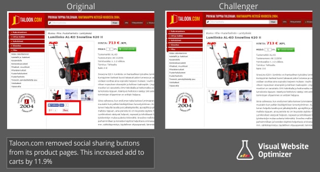
But the most interesting study is this one:
An AB Test on a Finnish shopping site showed that removing vendor share buttons led to a better CTR on their buy/shopping cart buttons by 11.34%.
There are two theories for why this worked:
It’s simple, really – remove your social share buttons from your product pages to improve your customer retention strategies. Leave them on your blog posts as part of your content marketing strategy, and that’s about it.
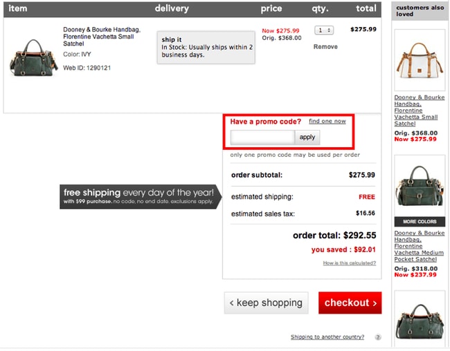
Everyone loves a good deal.
But that also means everyone wants to seek out a deal if they’re not currently getting one. Which is why promo code boxes can be so distracting. You know, these things:
When most people see a promo code box, it acts as a trigger to seek out a promotion. There are several reasons why an e-tailer would want to avoid sending a shopper to search for a coupon:
All bad. What’s a store owner to do?
Linda Bustos from Get Elastic suggests hiding the promo code box from visitors who don’t have a code and selectively showing it to only visitors who have a code. She writes:
1. When a customer arrives via an affiliate link or email with a promotion, the URL includes a parameter indicating the shopper has a promo code which is stored in the shopper’s session. When the shopper arrives at the checkout page, the parameter is looked up in the session and the box is displayed. Customer enters promo code manually. All other customers do not see a box.
2. The URL parameter includes the promo code and the discount is automatically applied at checkout. The customer does not need to enter a code, nor does a coupon box need to be displayed.
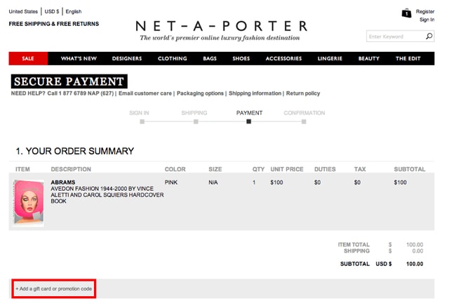
Of course, this can get complex with coding and other necessities. Another option is to make the box more discreet by hiding it behind some linked text, like this:
Both ways work – it just depends on how savvy you want to get.
While many eCommerce experts share customer retention strategies that truly work, a lot of garbage can get muddled in with the clean water when trends and fads come around.
Want to retain customers? Book a demo of our platform to learn how!
Removing the 5 widgets, tools, and “best practices” we revealed in this article should help you retain your customers and increase your customer lifetime value. But again – be sure to test these things to make sure you get similar results.
Don’t wait – take action on these steps today and retain your customers.
Over to you – what common customer retention strategies have you tried in your store that actually hurt conversions? Let us know in the comments below!