Products
Case studies
Industries
Resources
I’m an Influencer

Table of Contents
By Ross Beyeler, Partner and COO of Trellis
Visual content has the incredible potential to drive up your eCommerce conversions. And we’re not just talking about product photography (although that’s definitely important). Other visual content like video, product demos, User Generated Content, and illustrations can be incorporated to improve the user experience, build a stronger relationship with your customers, and ultimately drive more sales.
But it won’t work to just throw every visual element you can think of at your site and see what sticks. (Plus, who has the time or money to do all of that at once?). Just like with everything else, you’ll need a strategy based on how well you know your customers: What they want; what they like; and what they need.
There’s a variety of visual media types that work well for Shopify sites. Let’s take a look at seven that have the biggest potential to help drive conversions in your online store:
Site design plays a big part in how successful these visual elements are for driving conversions. It’s not enough to just throw together a product gallery of your best selling SKUs and place it on your homepage. How all of these elements integrate into your visual branding and site’s user experience are critical to the power that they can bring to your business.

When a customer posts a photo that includes your product to a social media site you have just received one of the best sources of excitement and inspiration possible! This material is most commonly known as User Generated Content (UGC). Check out these cool customer photo examples.
Finding a way to integrate all of that customer enthusiasm while also making the Instagram feed on your Shopify store shoppable which leads to multiple benefits. It can build stronger relationships with your customers and fans, help grow your customer base, encourage repeat buyers, and raise your brand profile.
Who wouldn’t get excited to be featured on a brand’s website with a photo they took and shared themself?
The validation that User Generated Content provides is as powerful (or even more so) than that from media sites. People trust other people – regular, everyday folks like themselves.

Better yet, people get excited and inspired to see what kinds of products others are using and loving – like the Instagram images of Sol de Janeiro’s skin care products.
A great post on Bootstrapping eCommerce gave the statistic that “an A/B test of 5,723 visitors to a top eCommerce site showed that including Instagram photos on the product page of one of their top sellers increased orders by 24.3%.”
Some great ways to make the most of User Generated Content (UGC) on your site and drive conversions include:
Most shoppers prefer to see customer photos over professional photos when shopping online because it gives them a better idea of what products actually look like and how they will perform in the real world. UGC inspires potential customers and enables them to understand how they could benefit from using your product.
Get inspired by these eCommerce UGC examples and start integrating yours!
>> Pro Tip: Run branded hashtag campaigns and encourage people to share photos of themselves with your product.
You can tell a visual story about your brand as a whole, a product category, a product line, or a specific product using a photo gallery. A good photo gallery uses a mixture of product and lifestyle photography. While high-quality product photos are helpful to show how your product looks from different angles, as well as the details and design, they rarely create inspiration or excitement for shoppers.
Supplementing product photography with on-brand lifestyle imagery lends an emotional aspect and helps your customers see themselves in the situation of using your product.
Lifestyle photography features people using your products in a way that tells a story, like the image below from fashion merchant Mahi Gold.
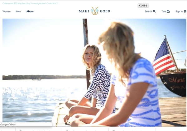
The key component for successful lifestyle imagery is to have a deep understanding of your customers as well as what they want from your brand and products. With this understanding, you can then use photography that relates to their interests and lifestyle.
Seeing yourself reflected in an idealized or new way can lead to a strong desire for the image you’re presented with. In turn, opening the door for you to become a potential consumer.
Show shoppers how their life could benefit from using your product. If you truly understand your customers and what they want you’re bound to fuel a sense of excitement!
>> Pro Tip: Make your lifestyle images bigger. If you’re not already using full-screen lifestyle imagery, give it a try. Many brands have conducted A/B tests with different sized images and found that larger images result in higher conversion rates.
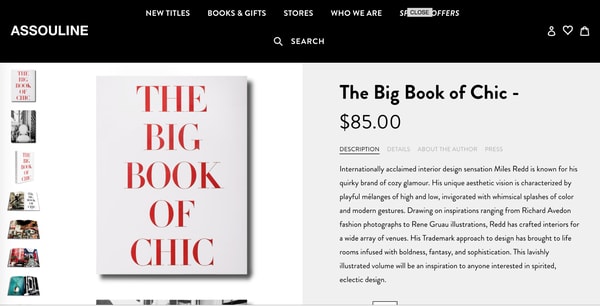
Detailed product imagery can include:
All product photos should be clear and in-focus with high-quality lighting. Being able to realistically understand what the entire product looks like – from the back to the smallest detail – goes a long way to instilling trust.
The colors you choose to use on your Shopify site are not only a reflection of your brand identity – they also play a key role in helping to drive on-site conversions. A consistent color palette across your site will support a user-friendly UX, and draw shoppers’ eyes to your calls to action.
When choosing a color palette for your online store, the first step is to draw on your brand’s colors. Your site should be consistent with your overall branding, including your logo and marketing collateral. Don’t go crazy – a simple palette of no more than five colors is ideal.
The five colors should each be defined for a specific use. You’ll want to choose colors for:
A consistent, on-brand palette that defines a specific purpose for each color makes your site easier for shoppers to navigate and it will drive their attention towards your primary CTA buttons.
>> Pro Tip: Use an app like Coolers.co to help you create an aesthetically-pleasing color palette for your Shopify site!
If you want to make your brand’s story come to life – or a specific product/category – video is the way to go. Crafting a video can help your customers connect more powerfully with your brand, communicate the benefits of your products, and explain in more detail than photography ever could.
Want to integrate videos from social media into your website? Book a demo to check out Flowbox today!
When integrating video into your Shopify site, it’s important to consider what your primary goals are. Most videos for eCommerce purposes can be categorized as either product, lifestyle, or educational content.
The ideal is to strive for a mix of all three types and to publish these videos in multiple locations on your site, such as:
Product Videos like this one for Cubii are a compelling way to engage consumers, especially when they’re on mobile devices. To help increase conversions, product videos are most useful on the product page.
While the content of your videos will depend on your product and customer interests, they are often used to successfully show the product in action and craft a story around the benefits it delivers.

Lifestyle videos are often used to tell a story about the brand and its vision, creating a more emotional connection. A video could reflect the ideal shopper using your products, a demonstration off the type of lifestyle your customers enjoy, a focus on your company history, or a customer interview.
Additionally, a lifestyle video could be an aspirational story about your brand’s identity, like Patagonia’s videos of extreme mountain climbers.
By providing an educational video you can help shoppers overcome significant hesitations, especially for complex or high-priced products. Even once you have achieved a sense of trust, your product may require additional explanation and details to connect a shopper’s problem or interest with your solution. Educational content like how-to videos, on-site how-tos, product demos, and spec sheets can address a gap in information provided on the product detail page.
Overall, videos can address uncertainty, ease new users into success and prevent returns. Ultimately helping to drive sales and increase conversions.
The key is to not bury your video content. Make it visible and easy to find.
For some product categories, technical content like specification sheets are a critical data point for communicating detailed information. These kinds of documents are linked as downloadable files or separate landing pages, like the example below from Siren Marine.
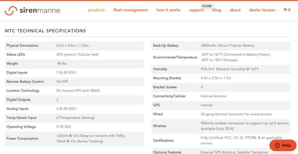
The two key factors to ensure that technical visual content contributes to conversions is that the images load quickly and display equally well on mobile screens. Using large and appealing content while ensuring that all useful data has been provided is also important.
Brands that go the extra mile to use custom graphics and illustrations within their eCommerce store create a more on-brand and unique site.
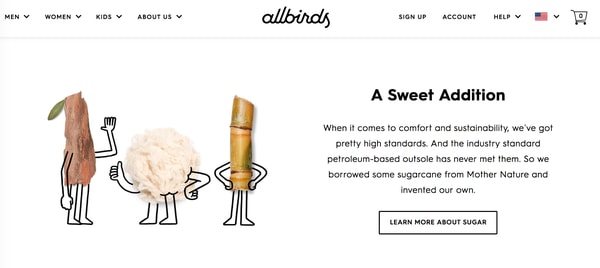
Allbirds is one brand that’s doing an amazing job. Including illustrations contributes to a strong aesthetic identity, as compared to those sites that stick with a logo, product photos or stock imagery.
You don’t need to have a massive budget to introduce custom design work into your site – resources like 99Designs and other freelance marketplaces can make it relatively easy and affordable.
Now that you have several different types of visual content in your Shopify site, it’s time to think about how to organize your visual content and optimize it to ultimately increase conversions.
Four important considerations for your visual content are:
One way to answer the last consideration regarding how all content should work together is to consider the different types of visuals that you have (photography, illustration, video, social posts, etc.) and consider where each piece could deliver the most value to your customers. Then, consider which pieces work best together to tell a more complete story – maybe a product video is best supported by technical illustrations; or a featured photo gallery is supported by links to relevant blog posts and customer reviews.
Creating strategic connections between visual content will make it easier for your customers to explore and gain value.
>> Pro Tip: Avoid clutter by limiting visual content to two-to-three different types per page. First, select one piece of primary content. Then, select one or two pieces of associated content that will support your primary content as well as the strategic goal for that page.
Whether your priority right now is to build trust, foster excitement, or help educate your buyers, visual content is a powerful tool for improving your on-site design with an eye on growing conversions.
It isn’t just as simple as taking a great photograph and posting it on the product detail page.
Integrating tools, like Flowbox’s visual marketing platform, will allow you to make any User Generated Content instantly shoppable. In turn, you will create an optimization powerhouse.
Using beautiful imagery, telling a targeted story, and embedding those images with eCommerce functionality is the key to success and growth in a competitive marketplace. Not to mention building mutually happy relationships with your customers and evangelists.
Ross Beyeler is the Partner and COO of Trellis, an agency that provides strategy, design and development services to eCommerce companies.
