Table of Contents
Do you want to increase your conversion rate? Duh, of course you do. Read on for 14 expert tips for increasing your conversion rate as well as some case studies of brands who have managed to increase conversions.
With average eCommerce conversion rates hovering around 3%, it can be hard to get your visitors to become customers. I’ve been through several website redesigns myself, and I’ve found some things you will want to consider adding when you pull the trigger on this massive project. We’re going to walk you through the best practices listed below:
A website redesign is not an easy, quick, or simple project. A lot of planning goes into it. Whether you’re in the midst of planning your redesign, you’ve just begun thinking about possibly redesigning, or you’ve already begun the project, these 14 tips are sure to be valuable to you and will help you increase your conversion rate.
When wanting to increase your conversion rate we recommend not overlooking the humble search bar. Visitors using the search bar on your website are 5-6x more likely to convert than those who don’t. Why? Because visitors using site search are later in the buying journey than user’s who are simply browsing.
[Tweet “If your search function doesn’t perform well or is difficult to find, you’re losing customers.”]
It’s estimated that roughly 30% of visitors will use site search. That number will be higher or lower depending on where your search bar is located and how obvious it is.
Here are a few tips to optimise user’s site search experience:
Here’s an example of a search bar done right. It stands out and works well.
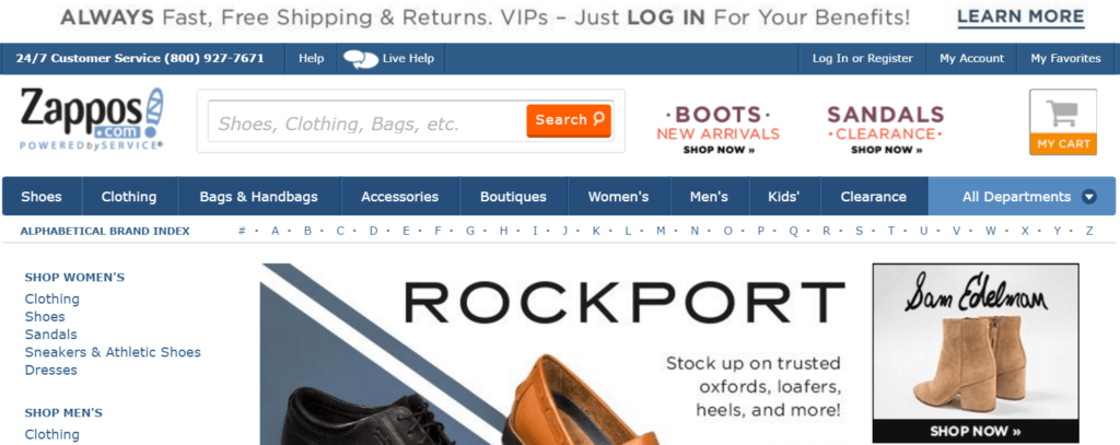
Here’s an example of a search bar done wrong. It blends in and doesn’t perform well.

Exit pages are the pages which people exit your site from. You can find your exit pages through your Google Analytics account.
To get to your exit pages, go to Behavior -> Site Content -> Exit Pages.
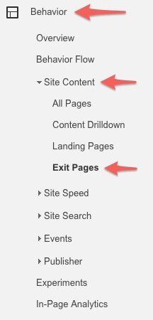
Once you reach this page, Google will show you your exit pages.

The above example is from my blog about living in an RV. The “/” is my home page – 99% of the time your home page is going to be at the top of this list. However, we’re not worried about the home page here, we’re worried about the second through fifth highest pages.
Here’s what you can do to improve a high-exit page:
Don’t do all of these things, but just the ones that make sense. Basically, your goal on an exit page is to guide viewers to the most obvious next step. Give them somewhere to go so they’ll be less likely to leave.
People want to be able to trust you before they buy from you, and one of the best ways to quickly establish trust is by showcasing your contact info right on the front page. Live chat furthers this trust and consumers often now expect live chat on a website – it’s a great way to increase eCommerce conversions.
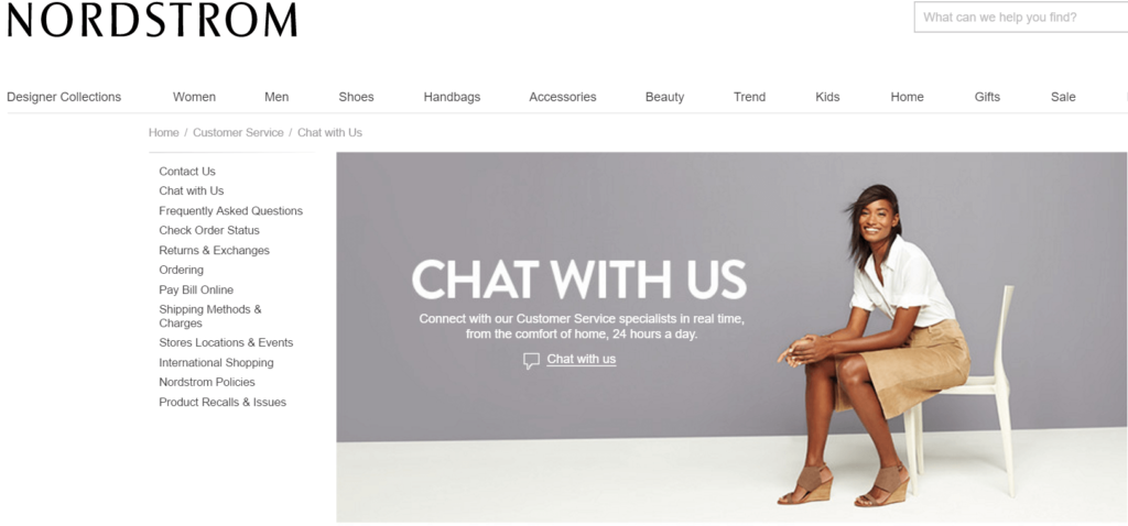
It’s not just the people saying it – businesses are seeing huge conversion increases when adding live chat to their websites. Live chat increased Backcountry’s conversions by 15-20% for example.
Live chat is one of the best methods of customer service, beating email and phone. It’s been proven to improve eCommerce conversion rates.
If you have a web designer to add this feature for you, great! If not, here are a few pre-built solutions you can try:
Gamification is the act of using video game elements in a non-video game setting. For example, eCommerce stores can add a progress bar to show shoppers how close they are to spending enough to get a discount.

Video games are built to play to our brain’s natural reward centers, which give us a boost of dopamine (our “feel good” drug) every time we make any small achievement, like levelling up or beating a tough boss.
We can use this to our advantage by showing a progress bar whenever a user is on their way to a certain goal, like creating an account or buying enough to get a discount on their order.
Adding game elements taps into people’s natural psychology, pushing them to complete the goals you set, like spending more money on your products.
There are plenty of ways to add gamification to your store. Some of the most popular include:
Have you ever seen a website that looks like it’s from the 90’s, with a million different things going on? You have no idea what to click on, and there are so many options it makes your head hurt…
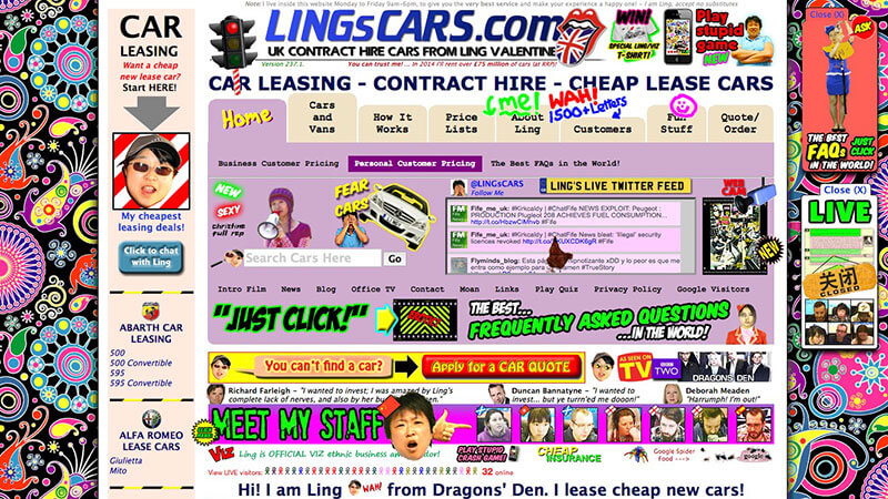
via weareo3
…you don’t want to be that website.
Fewer is better when it comes to options. Simplicity rules.
Make it obvious where you want your visitors to click. Of course, the above example is an exaggeration, but there are plenty of eCommerce stores with a similar amount of “stuff”. When you have 50,000 products, it can be easy to let it get out of hand.
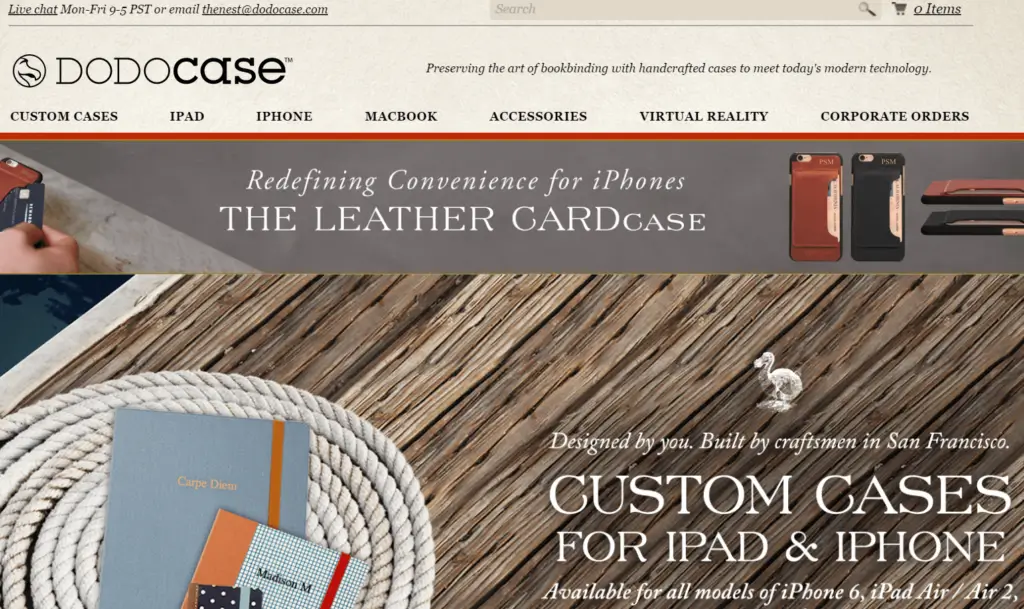
One of my favourite examples of a simple eCommerce site is DodoCase. They don’t overwhelm you with buttons, sidebars, scrolling images, or extra junk. You might also notice they contain 4 of the 5 tips I’ve mentioned so far – can you find them all?
So, how can you make your website more simple?
There are plenty of ways. Some of the best include:
I was recently shopping for a drinking water hose for my RV. I didn’t know much about them, so I used an Amazon scraper to pull in reviews. I found one that was cheap, but then I started checking out the reviews. As it turns out, the life lesson “you get what you pay for” seems to hold true here. One review, in particular, caught my eye and made me change my mind about what to buy.

I ended up buying the Camco hose he recommended after reading more reviews saying the same thing – they’re good and last. I’m not alone; 49% of consumers trust online reviews to the same extent as recommendations from friends/family. Real user reviews matter.
More than 99.9% of shoppers check out reviews while making online purchases, with 96% actively seeking out negative feedback.
Getting your customers to leave good reviews of your products isn’t just a good idea – it’s necessary to increase your conversion rate and stand out from competition.
Some ways to increase your chance of reviewing good reviews include:
Consumers have seemingly infinite options when it comes to shopping online, which means that if they don’t trust your brand…they are unlikely to convert and head elsewhere.
To boost conversion rates, eCommerce brands can concentrate on cultivating trust with customers through various strategies. This involves providing high-quality product imagery and detailed descriptions, showcasing customer reviews and social proof, offering secure payment options and transparent pricing policies, ensuring responsive customer support, maintaining consistent branding, optimising website design for user-friendliness, engaging in post-purchase communication, and providing guarantees or warranties. By prioritising transparency, communication, and customer satisfaction, brands can establish credibility and foster trust, leading to higher conversion rates and customer loyalty.
Want to learn more about how Flowbox can help you to build more trust with consumers? Book a demo today and we will walk you through how you can increase your conversion rate with Flowbox.
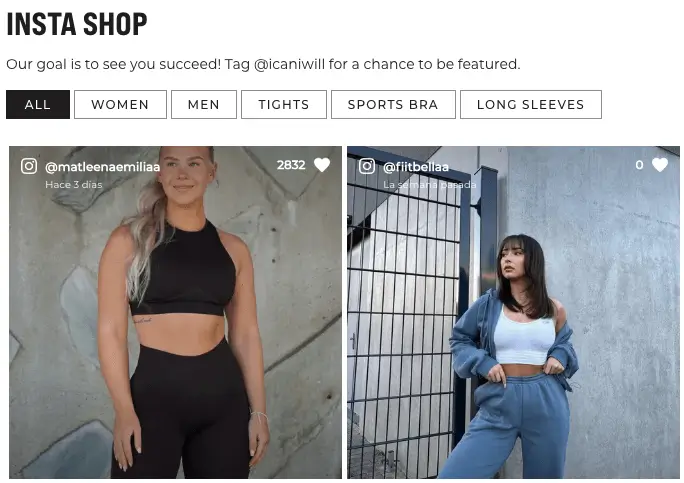
We’ve talked about establishing more trust with your customers to boost conversion rates, which leads us on to our next tip – increase your eCommerce conversion rate with UGC! When redesigning your website, you should consider adding a page specifically for User Generated Content campaign. I’m not just saying that because Flowbox is all about UGC; The facts back it up. In fact, User Generated photos have a 5 times higher chance of converting customers compared to professionally produced content, making the right platform a potentially lucrative investment.
UGC Case Studies
A huge number of brands around the world that sell online are starting to use visual UGC in their eCommerce shopping experiences due to the significant impact this form of social proof has on their sales. The results speak for themselves as you can see in the following case studies:
How to Garner and Showcase UGC
You may already have some User Generated Content you don’t know about. Search Twitter and Instagram for hashtags of your brand, if you aren’t already actively capturing that data.
If you don’t have any, encourage your customers to submit their pictures and reviews through a UGC contest. Platforms, such as Flowbox, allow you to pull in these photos, make them shoppable and embed the Instagram feed into your website.
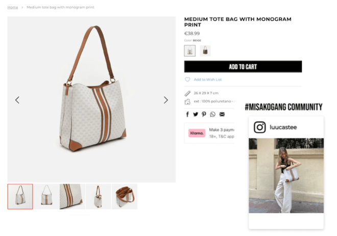
Here is an example of how Misako uses UGC on its product pages:
Have you ever been at the checkout page of an online store, only for them to require you to create an account? I don’t know about you, but I hate that. Again, I’m not alone. It’s been found that up to 34% of shopping carts are abandoned due to forced registration.
Don’t force people to register an account on your website. It will only harm sales, and in some cases even make people resent you.
Oh… and you have heard of the $300 million dollar button story, haven’t you?
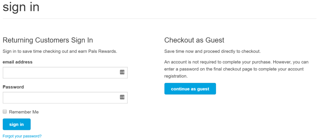
Instead, offer a “guest checkout” option, where they don’t need to create an account. Then, since they entered their name and email anyway, you can just mail them a link to generate a password so they can create an account easily and painlessly.
[Tweet “Don’t Require Users to Create an Account – Do It For Them”]
Petco allows you to checkout as a guest.
You could also try using the login with Amazon feature (aka Amazon Payments), as many people now have an Amazon account.
Mobile purchases are predicted to make up 44.6% of all retail sales in the US in 2024. There’s no doubt about it – mobile is becoming more important than desktop.
More people now own a mobile device than own a desktop computer.
I personally shop on my phone, but I typically only do so through the Amazon mobile app. Having a mobile-friendly site isn’t enough – people are spending 90% of their time in applications, and only 10% in web browsers.
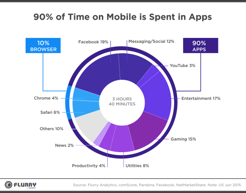
You’re leaving a lot of money on the table by not being mobile friendly or developing a mobile app.
I know, I know – I hate popups too. But the fact of the matter is, they work.
Remember my point above about simplicity and making the next step obvious? Popups eliminate distractions, provide your visitor with a last chance offer, and give them a simple decision: move forward or don’t.
An “exit intent” popup (well, they’re really lightbox overlays since they don’t open in a new window) is a box that pops up when a user’s mouse leaves the web browser. They typically contain a discount offer or email subscription and take up most, if not all, of the page.
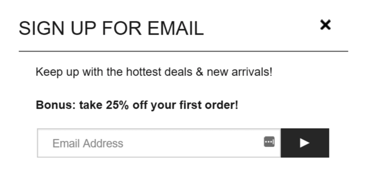
There are a few things you want to keep in mind when using exit intent overlays:
There you have it – 14 things to consider when you’re redesigning your eCommerce site. Phew, that was a long post – thanks for reading all the way through! I hope these tips help you increase your conversion rate, engage with your customers, and keep them coming back.
Testing is one of the most powerful methods for optimising conversion rates with data-driven adjustments and minimising risks. The insights you gain in these tests can then help you to increase your conversion rate. Evaluating the impact of changes made to your pages is essential before determining their effectiveness in improving conversion rates. A/B testing enables you to compare variations of a webpage against the original, identifying which version yields higher conversions and thus can be implemented universally.
By employing this approach, you entrust your visitors to select the version that resonates best with them, thereby steering clear of assumptions in your Conversion Rate Optimisation (CRO) strategy. Consider utilising VWO Testing to generate page variations and identify those that significantly enhance your conversion rates.
If you want to increase your conversion rate, don’t forget about cart recovery!
Cart abandonment presents a widespread challenge for all websites, and you’re not alone in facing it. Failing to take proactive measures to re-engage lost visitors or prevent cart abandonment could result in significant revenue loss. Some brands send abandoned cart emails with personalised recommendations included, turning incomplete sales into complete sales.
Remember, every abandoned cart represents a missed opportunity for revenue. By implementing effective strategies to reduce cart abandonment and re-engage lost visitors, you can unlock significant growth potential for your business. Don’t let valuable sales slip away – start optimising your conversion process today!
Let’s face it, modern consumers are used to being able purchase everything they need at the click of a button. Make it as easy as possible for your customers to complete the checkout process because if you don’t, most likely many customers will give up and shop elsewhere.
Streamlining the checkout process is crucial for eCommerce brands not just when it comes to creating an increase in eCommerce conversion rates but also to reduce cart abandonment rates and improve overall customer satisfaction. Here are some popular ways to enhance checkout processes:
There is clear evidence that the addition of UGC using the right platform can have a concrete and positive impact on conversion rates. Our case study with furniture leaders ScS found that their users who interact with UGC convert x4.1 more than those that don’t. Similarly, Saniweb saw that their website users who interact with UGC convert x5.5 more.
Furniture and home interior providers VOX, increased their overall conversion rate by 18.65%. Here is what Damian Miziolek, eCommerce specialist at VOX had to say about the decision to improve their website with the addition of content from social media:
“One of the most common problems that people faced on our website was not a satisfactory amount of photos and reviews of our products. We thought about launching a basic review section on our product pages, which asks customers to write a few words about what they bought – but it would be an old school method. Luckily, the idea came from the users of our social media channels. For the past few years, the amount of amazing interior photos people uploaded on Instagram increased immensely. We are constantly amazed by how our clients use our products and make them work in their own style. Consequently, we thought it would be a great idea to use this kind of content as visual reviews.”
Damian Miziolek – eCommerce specialist at VOX
Unisa saw an overall conversion rate increase of 16.03% thanks to their adoption of the Flowbox platform and addition of UGC to their website. Check out their dedicated community page below:

We hope you have found this guide on how to increase eCommerce conversion rates helpful. Now it’s your turn. Thanks, and good luck!